
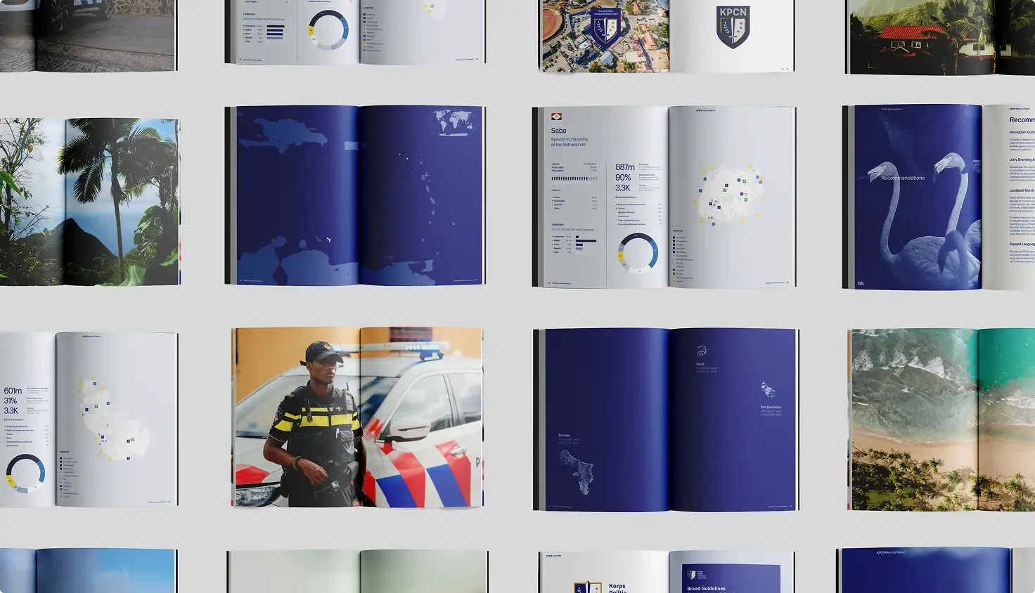
KPCN unveils new identity: one force, three islands, one story

Would you like to know more?
Get in touch with Simon
Stay Connected
Curious about how branding and consumer psychology intersect? Subscribe to our newsletter for expert insights and strategies built around our core service pillars: identity, development, and 3D & Ai technology. Let’s help your brand forge deeper connections.
KRALENDIJK — Fifteen years after the constitutional reform of 10.10.10, when Bonaire, St. Eustatius and Saba became special municipalities of the Netherlands, and the Caribbean Netherlands Police Force (KPCN) entered a new phase with a modern, powerful, and unified identity for all three islands. In collaboration with The Brink Agency, the force developed a new logo and complete visual identity that reflect the unique culture, energy, and pride of the Caribbean Netherlands.
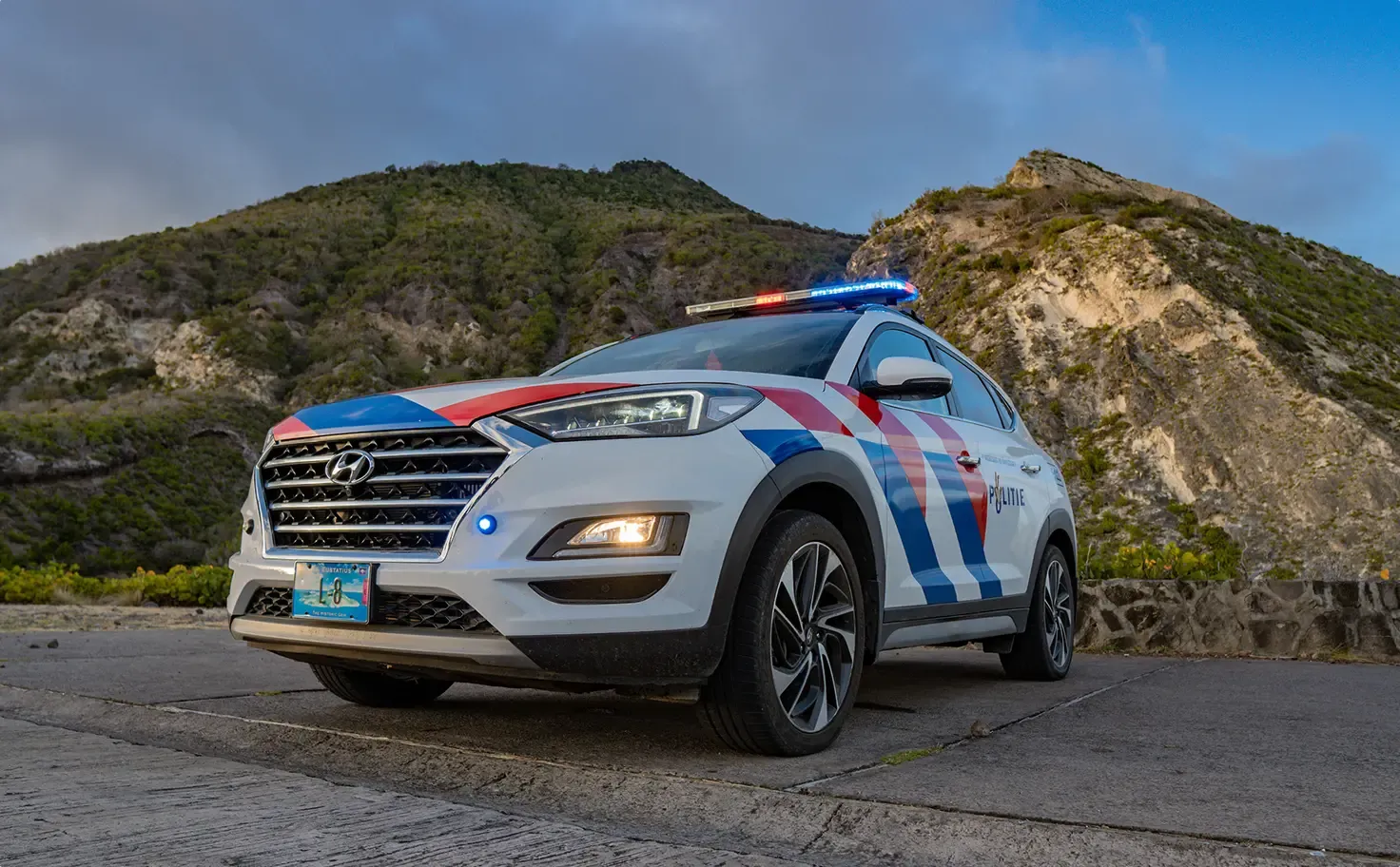
The new identity represents what KPCN stands for today: a police force that brings people together — professional yet approachable, deeply connected to its communities. This rebrand shows that KPCN does not serve three separate islands, but protects one shared community.
With one consistent symbol — visible across uniforms, vehicles, and buildings — the force reinforces its mission to unite Bonaire, Statia, and Saba in trust and collaboration.
From the islands, for the islands
The new identity is the result of months of research, dialogue, and collaboration across the three islands. Officers, residents, and young people shared their stories, helping shape a design that truly belongs to the islands themselves.
“We listened, observed, and felt what makes these islands unique,” says The Brink Agency. “That strength, warmth, and pride are now captured in the new identity.”
![]()
A symbol of unity
The new identity embodies connection and pride. The three stars shine as an ode to Bonaire, Statia, and Saba — islands with distinct character, yet united by one mission. The sword represents strength and justice, the shield stands for trust and protection, and the colors blue and white capture the spirit of the Caribbean Sea calm, strong, and ever-connecting.
The new brand aligns with KPCN’s renewed slogan:
Safety, Justice & Service — Veiligheid, Rechtvaardigheid & Dienstbaarheid.
The official launch will take place on Friday, October 10, 2025, in Kralendijk, with a live broadcast for St. Eustatius and Saba.
KRALENDIJK — Vijftien jaar na 10.10.10, het moment waarop Bonaire, Sint Eustatius en Saba bijzondere gemeenten werden, krijgt het Korps Politie Caribisch Nederland (KPCN) een nieuwe fase: een moderne, krachtige en gezamenlijke branding voor alle eilanden. In samenwerking met The Brink Agency ontwikkelde het korps een nieuw logo en volledige identiteit die past bij de unieke cultuur, energie en trots van de drie eilanden.
Het nieuwe merk vertelt waar KPCN vandaag voor staat: een korps dat mensen samenbrengt, professioneel én menselijk, diep verbonden met de samenleving. De nieuwe identiteit is nodig om te laten zien dat KPCN niet drie losse eilanden bedient, maar één gemeenschap beschermt. Met één herkenbaar symbool dat overal zichtbaar wordt — op uniformen, voertuigen en gebouwen — benadrukt het korps zijn missie om Bonaire, Statia en Saba te verenigen in vertrouwen en samenwerking.
“Het is meer dan een logo – het is een belofte aan de mensen die we dagelijks dienen,” zegt de woordvoerder van KPCN.
Van de eilanden, voor de eilanden
De nieuwe identiteit is het resultaat van maanden onderzoek, gesprekken en samenwerking op Bonaire, Statia en Saba. Agenten, jongeren en bewoners deelden hun verhalen, waardoor het ontwerp echt van de eilanden zelf komt.
“We hebben geluisterd, gekeken en gevoeld wat deze eilanden uniek maakt,” zegt The Brink Agency. “Die kracht, warmte en trots zie je nu terug in de nieuw identiteit.”
![]()
Een symbool met betekenis
De nieuwe identiteit ademt samenwerking en trots. De drie sterren schitteren als een ode aan Bonaire, Statia en Saba – eilanden met eigen karakter, maar één gezamenlijke missie. Het zwaard staat voor kracht en rechtvaardigheid, het schild voor vertrouwen en bescherming. En de kleuren blauw en wit vangen de ziel van de Caribische zee: rustig, sterk en altijd verbindend.
Het merk sluit aan bij de vernieuwde slogan van KPCN: Veiligheid, Rechtvaardigheid & Dienstbaarheid — Safety, Justice & Service.
De officiële lancering vindt plaats op vrijdag 10 oktober 2025 in Kralendijk, met een livestream voor Sint Eustatius en Saba.

The Agencies Winning Attention are not Creating More Content
Read this article

From CAD Files to Photorealistic Worlds
Read this article

The Tools Are Moving Faster Than the Work
Read this article